Planted Mobile App + Website UX Design
Planted is a mobile app and website that identifies houseplant species, identifies any potential issues that those plants might have, and offers remedies for those issues. It’s designed for busy houseplant owners who have been burned before by plantcare plans that didn’t work – wasting both time and money on the wrong solutions, maybe designed for another species of plant altogether. Planted offers the right solution for the right houseplant…and that’s all there is to it. Users can fill their homes with as many plants as they like, without worrying so much about whether or not they have the time or money to take care of them. Planted has their back.
Planted was designed as a Google UX Design Certificate course project. Though it’s not real, it is based on real user survey results and what I believe is a real need for a better, more beautiful plant identification app – and website. One of the biggest research survey insights was that potential users wanted a houseplant identifier that worked just as well on their desktop computers as their phones. Competitive research showed that few real life competitors offer any functionality outside of mobile apps. Planted is an experience that’s available on any device and looks great on any screen size.
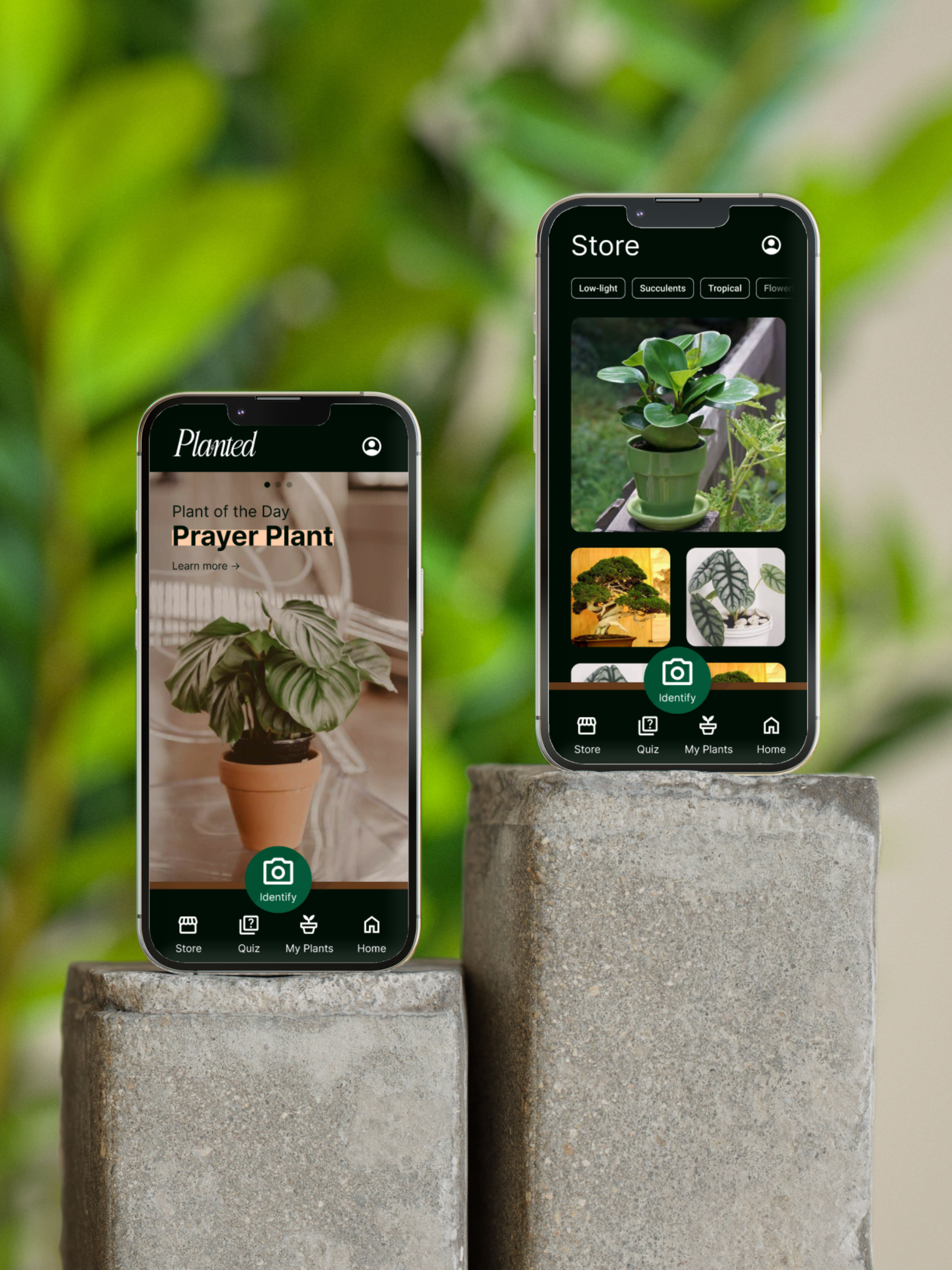
Starting with the App
Since users want a houseplant identifier that works on both their phones and their computers, starting with the app helped ensure that the design could be progressively enhanced into larger screen sizes. Users will not be losing any functionality simply because their screen size is smaller.
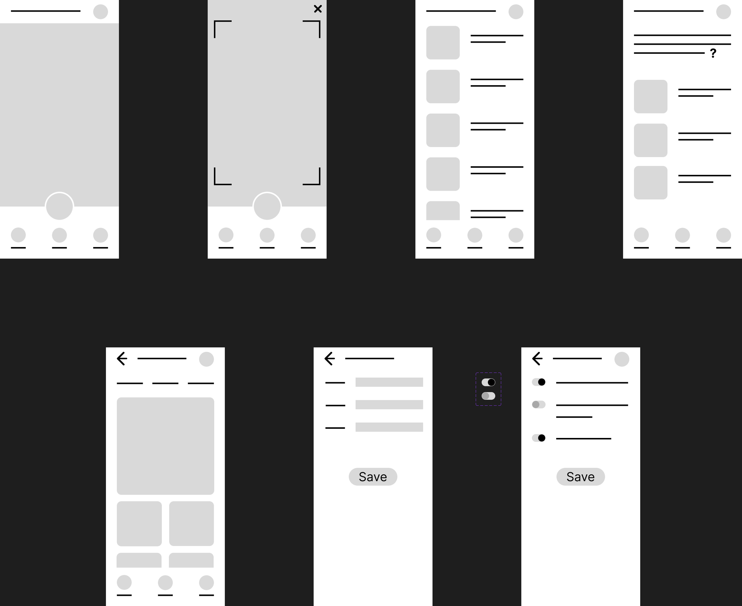
From Paper and Digital Wireframes to Mockups

These paper wireframes are where the basic layout of the app was formed. Making them was quick and easy, but what was created here made it all the way to the final round of design. It stood up to repeated usability testing and survived mostly unchanged.
The first usability test was done on these digital wireframes. The results of testing showed the navigation would need to be clarified and a new distinct page would need to be added to the main user flow.
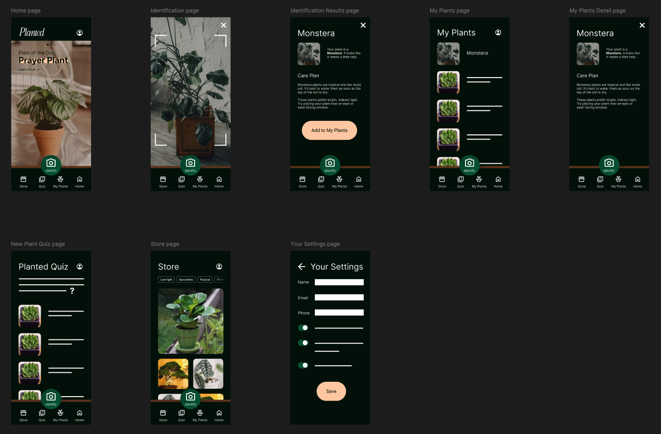
Adding color brought the design to life. These mockups were used for the second round of usability testing, which found that navigating to the app’s settings needed to be clarified.
Who is Planted for?
Users like Alex. Alex is a busy houseplant owner who needs to resolve issues with houseplants quickly and reliably, because she doesn’t want to waste time and resources on remedies that don’t end up working.
How does Planted help?
If users like Alex are able to quickly and reliably diagnose issues with their houseplants, then they won’t risk wasting time or resources on remedies that don’t work. Alex can buy as many houseplants as she likes without worrying so much about maintenance.
User Testing
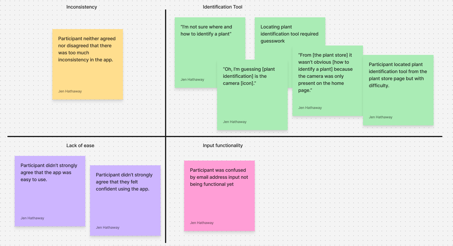
In the first round of usability testing, users didn’t navigate through the main user flow – using the identification tool – as quickly or easily as intended. Screen recordings and quotes from test users indicated that the design of the navigation wasn’t straightforward. The above Affinity Diagrams allowed test results to be grouped into relevant categories to be resolved.
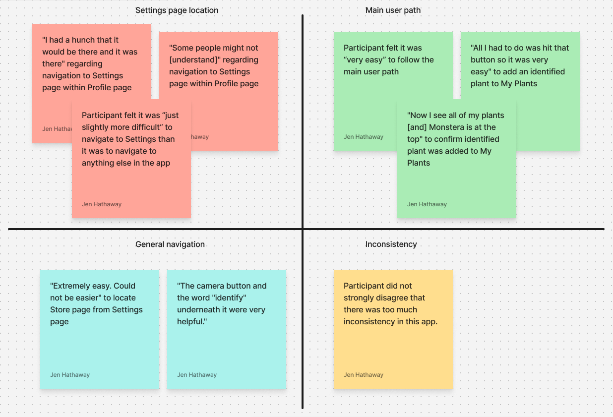
Ease and speed of navigating the app greatly improved in round two of usability testing, though it was clear that there was still some work to be done on navigating to the app’s settings.
Main User Flow
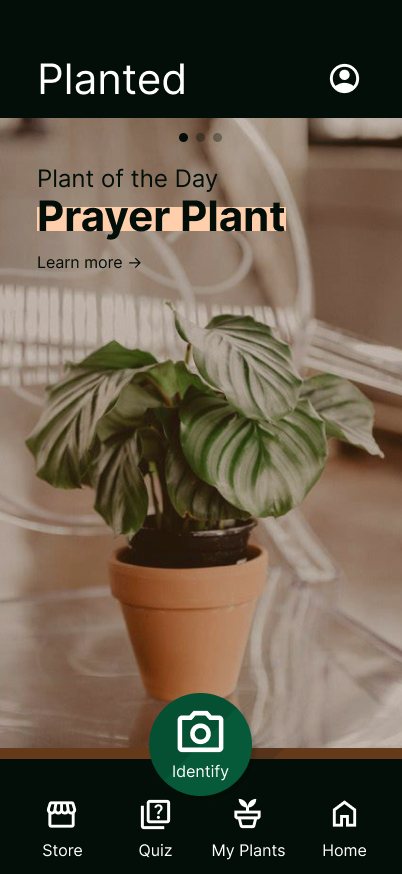
The first screen users see when they open the app. To continue the main user flow, identifying a plant, users are directed to a front and center button in a distinct color.
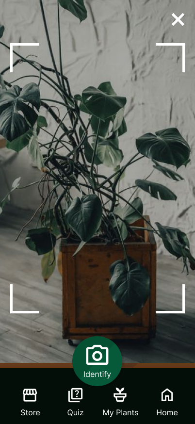
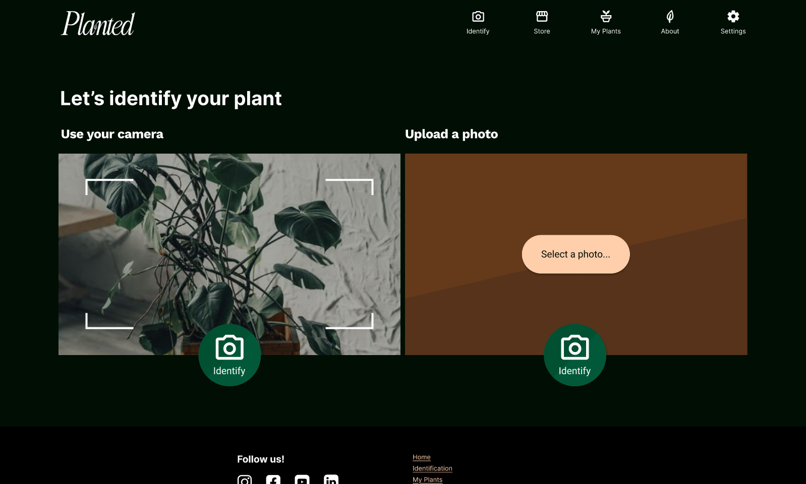
The identification page opens the user’s camera and directs them to reselect the same button from the navigation to take a picture of their houseplant.
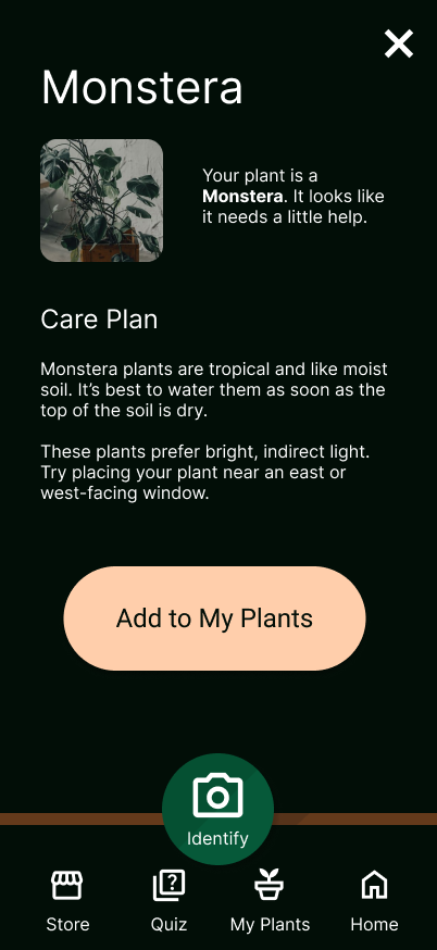
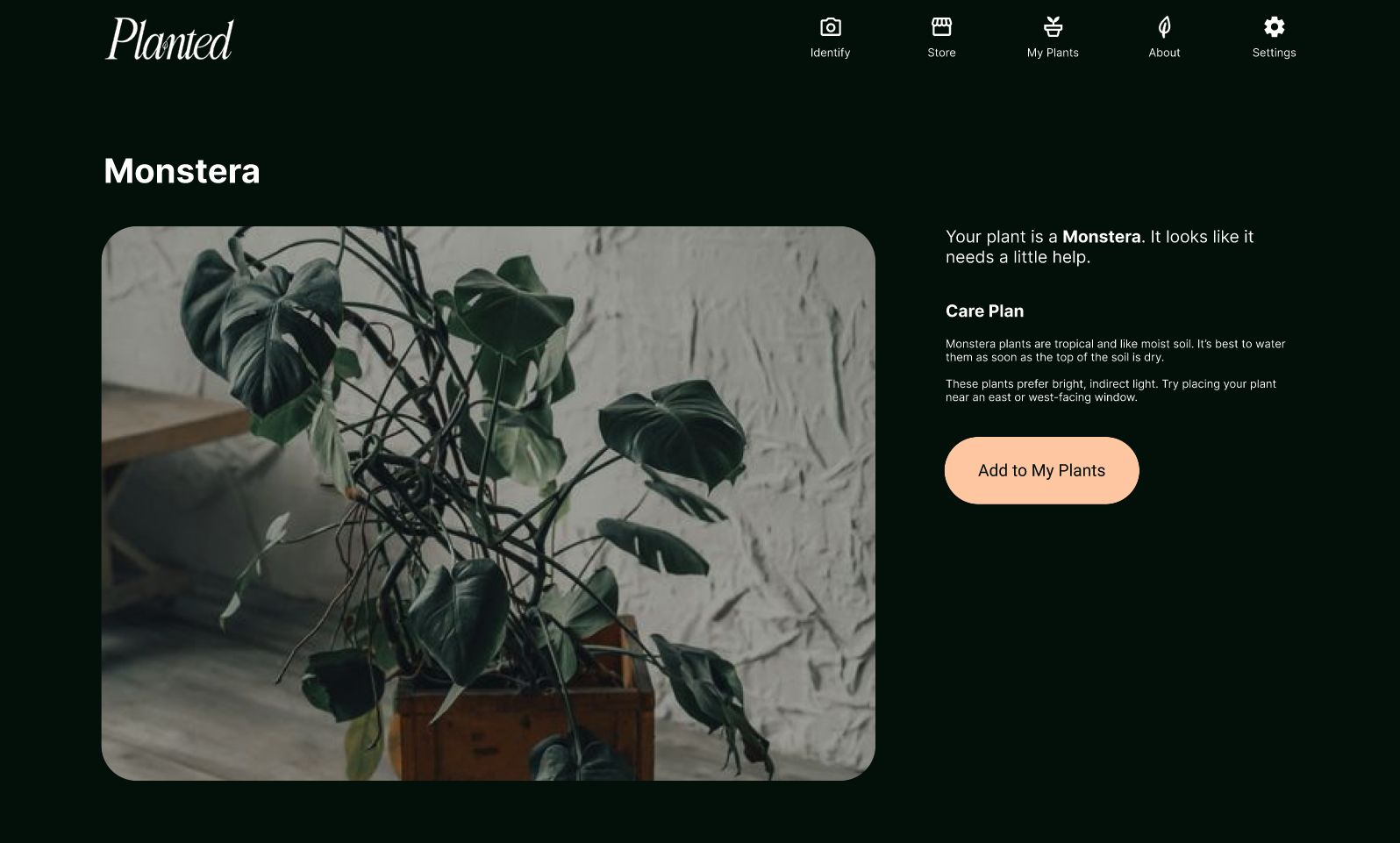
Once the houseplant photo has been taken and identified, users are offered a care plan for their houseplant and the option to add it to the houseplants associated with their account. The color utilized here is distinct from that of the identification tool, which would instead return users back to the beginning of the main user flow.
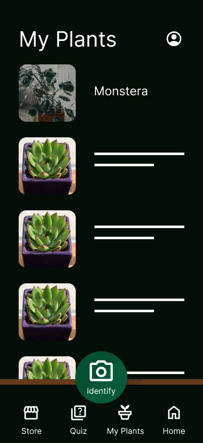
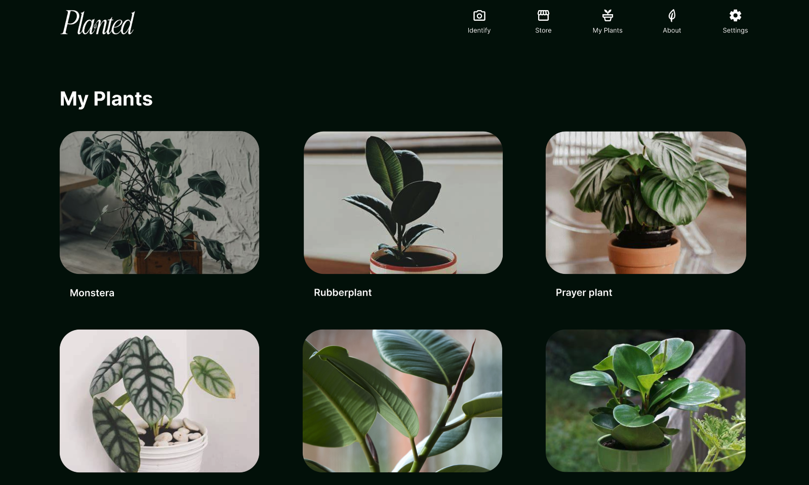
If the user chooses, their recently identified houseplant can be added to the My Plants page, along with any other houseplants that have been added.
Planted’s Website
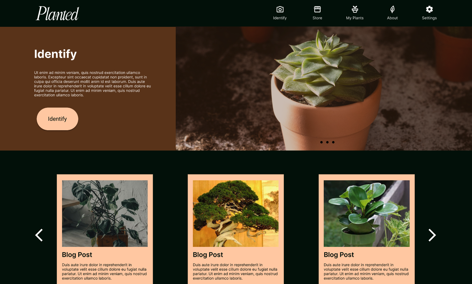
Since user research surveys indicated that potential users would prefer an application with all functionality included on both a mobile app and on a website available from their desktop, the main user flow on the website mimics the experience on the app, and the branding makes users feel like they’re in the exact same environment.
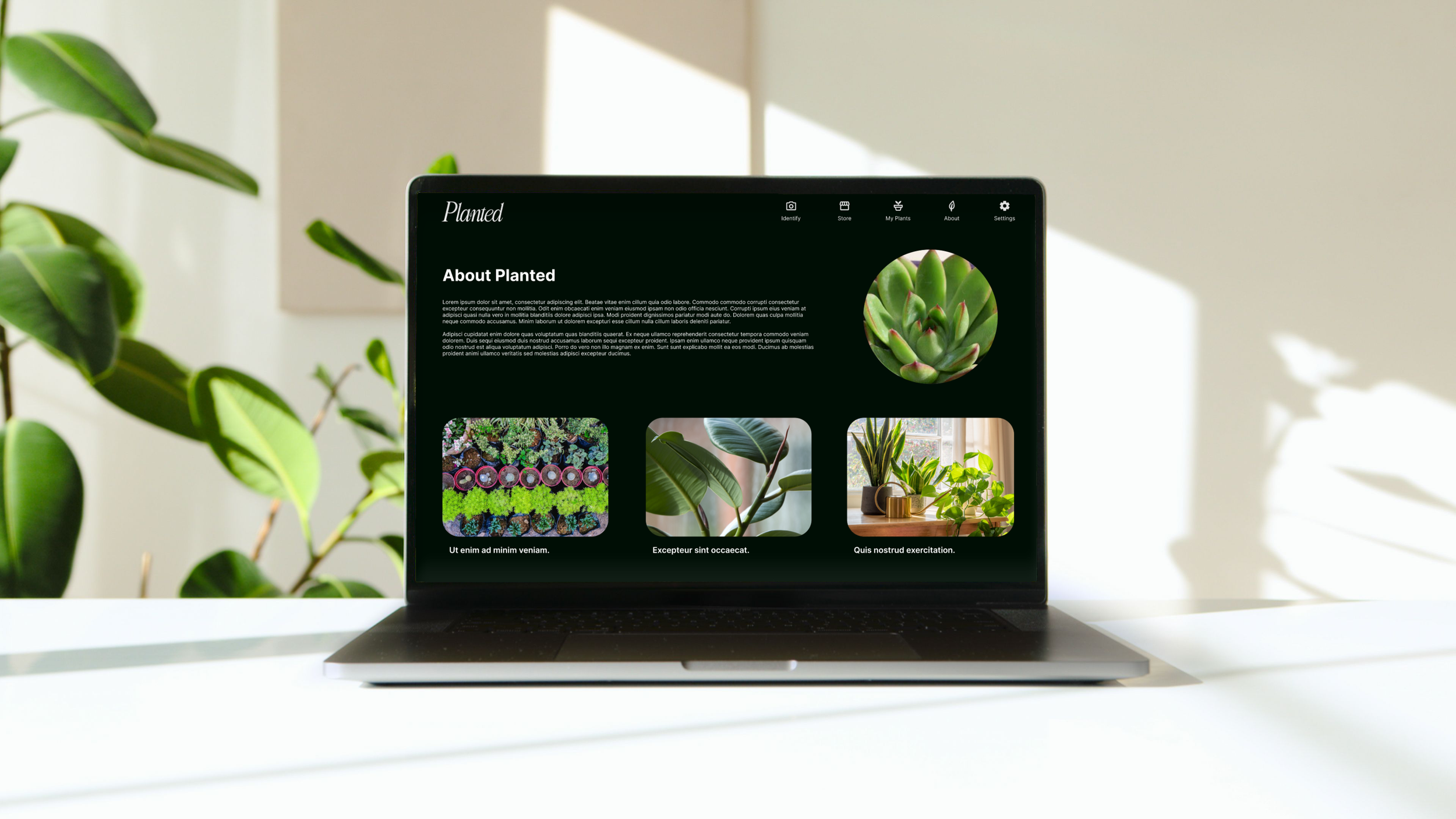
A Cohesive Experience from One Environment to Another